Whether you run an ecommerce site, a blog, or a brick and mortar business, you’ll love this guide.
Before “Conversion Rate Optimization (CRO) Techniques: The Complete List”, these techniques were scattered across the internet.
Now, they're all in one place.
Enjoy!
COPY TECHNIQUES
Add a benefit to your call to action
Replace boring calls to action with CTAs that show people what they’re going to get. For example:
- Instead of “Sign Up ” try “Spend less time with CRM”
- Instead of “Learn More” try “Yes, I want a diet that works”
Sources:
https://visualwebsiteoptimizer.com/split-testing-blog/call-to-action-increase-sales/
https://contentverve.com/case-study-31-54-more-conversions-signup-form-copy/
Add number of likes, users, followers or customers as social proof
Whether we admit to it or not, social proof has a strong influence on what we do. In the world of CRO, you can easily leverage this by featuring Facebook likes, number of customers, number of users, number of downloads, or any other indication of the number of people that trust your brand. Like anything in CRO, it won’t work in all cases. So if you already have social proof on your landing pages, you may want test removing social proof from your landing pages (or using a different form of social proof).
Sources:
https://visualwebsiteoptimizer.com/split-testing-blog/call-to-action-increase-sales/
https://blog.wishpond.com/post/98235786280/50-a-b-split-test-conversion-optimization-case-studies
Add numbers in your headline
There’s a simple reason that “top 10” articles dominate the internet: they attract clicks like a moth to a flame. Add numbers to your headlines to increase engagement and conversions.
Sources:
https://signalvnoise.com/posts/1525-writing-decisions-headline-tests-on-the-highrise-signup-page
https://contentmarketinginstitute.com/2011/06/headline-click-through-rate/
https://goinswriter.com/catchy-headlines/
Add reassurance copy
Add little bits of copy around your CTAs that make the user feel comfortable about their decision. Joanna Wiebe of CopyHackers.comcalls these “Click Triggers”. Mention free shipping, a money back guarantee, your privacy policy, or a key benefit. Booking.com is the king of Click Triggers. They sprinkle them everywhere. I count 4 of them on this single hotel listing:

Sources:
https://www.conversion-rate-experts.com/cro-tips/
https://www.copyblogger.com/call-to-action-buttons/
Add urgency to your CTA
Add a sense of urgency to your call to action and watch your on-the-fence visitors whip out their wallets. To up the ante, add specific numbers to your urgency CTA. For example: “Order in the next 2 hours for delivery today” or “Only 2 left” work better than “Supplies are limited”.
EasyJet does something pretty creative. They actually show you the number of other people looking at the same route. This makes you think “I better get this deal now before someone else does”:

Sources:
https://www.conversion-rate-experts.com/daflores-case-study/
https://blog.sendblaster.com/2011/07/25/designing-a-call-to-action-that-customers-can%E2%80%99t-resist/
Ask for micro-commitments
Micro-commitments let a visitor “date” you before getting married.
In the world of conversion rate optimization, micro-commitments can be used in two ways:
First, you can include tiny commitments at the top of your sales funnel. For example, you could offer a free trial or a monthly membership over a pricey annual plan. You can also emphasize smaller commitments in your sales copy. For example, use a call to action like “See a sample” over the high-pressure “Get a free quote”.
CrazyEgg does an awesome job with this technique. Instead of asking you to signup, they let you take their software for a spin:
Sources:
https://goodui.org/#44
https://preneurmarketing.com/essays/micro-commitments/
Clearly mark your top sellers
Marking a product as a top seller demonstrates social proof, which can often boost conversions. Here’s an example:

Want to take this to another level? Personalize your best seller list by customer segments or purchase history.
Sources:
https://www.widerfunnel.com/proof/case-studies/e-commerce-product-category-page-ab-test-example
Directly counter objections
Don’t be afraid to put customers’ barriers, doubts, and hesitations, on your site…and directly counter them.
Common barriers include:
- You don’t understand my unique problem
- Why should I believe you?
- What if it doesn’t work for me?
- It’s not worth the money
Try to counter objections at different points in your funnel. You can find these objections by surveying visitors (another technique from this guide).
Here’s a brilliant example of this technique in action:

Sources:
https://www.conversion-rate-experts.com/sunshine-case-study/
https://unbounce.com/landing-pages/exit-popups-make-your-offer-more-persuasive/
Don't show the number of people already on your email list (yes, really)
Social proof is tried and true sales tactics that works every time….Or does it? Derek Halpern found that removing the text, “Join 15,000 people already subscribed” actually improved conversions. We’ve found similar results at Backlinko. Why? It could be that people want email lists to feel small and more intimate. Advertising your giant list makes it sound like someone is going to get slammed with impersonal sales emails.
Sources:
https://diythemes.com/thesis/increase-conversions-split-testing/
Evoke emotion
There’s no way around it: emotions sell. This is true even if you’re in a so-called “boring niche”. Whether you sell weight loss products, business courses or parenting books, use copy that evokes emotion. This can increase brand recall and (if you trigger the right emotions) boost sales.
Sources:
https://contentverve.com/conversion-optimization-helped-a-nonprofit-increase-donations-274/
https://www.copyblogger.com/emotional-copywriting/
Feature high-revenue products above fold
Put your best-selling, most profitable products front and center in the ‘above the fold’ area of your site. This applies to your homepage and product and category pages.
Sources:
https://www.searchenginejournal.com/comprehensive-guide-e-commerce-conversion-strategy/112791/
https://www.slideshare.net/JoelAdamSmith/8-musthaveecommerceproductpageelementsabovefold
Get new users engaged immediately, even if they don't buy right away
If your site only has the options to “buy” or “not buy”, you’re alienating customers that need more time to make a decision. Get customers to engage with you immediately in some way – even if they don’t “buy” or “sign up” at first. This could be using a free trial, watching a video, or uploading a file. However, make sure that you carefully measure whether more engagement=more sales. There’s a fine line between engagement and distraction.
Sources:
https://www.conversion-rate-experts.com/photoshelter-case-study/
https://unbounce.com/landing-page-articles/the-benefits-of-using-video-on-landing-pages/
Give people more information
Landing pages for email opt-ins usually don’t need to give you a lot of information to get you to convert. A simple ebook offer usually does the trick. However, sales pages for complex or costly products usually require more information. Information product sales pages are notorious for insanely long sales letters. Why are they so long? Because people need a lot of convincing to invest in a pricey online course.
So if you have an expensive or complex product, don’t be shy about providing people with A LOT of information.
Sources:
https://contentverve.com/how-long-should-a-landing-page-be-simple-tips/
https://signalvnoise.com/posts/2991-behind-the-scenes-ab-testing-part-3-final
Hide negative social proof
You probably already know that social proof can skyrocket conversions. But if you have 10 customers and 50 Facebook Likes, your social proof can actually work against you. So make sure you hide any indicators of negative social proof that appear on your site.
Sources:
https://visualwebsiteoptimizer.com/split-testing-blog/social-proof-decreases-conversions/
https://unbounce.com/landing-pages/social-proof-proving-the-wrong-things/
Increase the quantity of your landing pages
As Hubspot reports in the linked study, companies with 10+ landing pages generate 55% more leads than companies with 5 fewer landing pages.

More landing pages means you can make more personal offers and search engines can send more targeted traffic. But be careful: this doesn’t mean just take the same offer and make 30 different designs. You should aim to make each landing page 90% unique: different offers, different customer segments, different leadmagents, you name it.
Sources:
https://blog.hubspot.com/blog/tabid/6307/bid/33756/Why-You-Yes-You-Need-to-Create-More-Landing-Pages.aspx
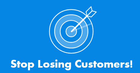
Leverage loss aversion
“Loss aversion” is a powerful psychological motivator. In other words: “Don’t lose customers” is usually more convincing than “Get higher conversions”. Research shows that people are MUCH more motivated to avoid a loss than to gain something new. Incorporating this into your copy can boost conversions.
Sources:
https://goodui.org/#30
https://en.wikipedia.org/wiki/Loss_aversion
https://pubs.aeaweb.org/doi/pdfplus/10.1257/jep.5.1.193
Make your About Us page more human
If you’re like most people, your About Page is one of the top 5 most-visited pages on your site. Don’t waste the opportunity to show people that you’re company is made up of real, likable human beings. Wistia’s About Page is a perfect example of this in action:

Instead of stiff headshots, Wistia lets their employees show off some personality.
Sources:
https://diythemes.com/thesis/amazing-blog-about-pages/
https://shawngraham.me/blog/how-to-write-great-about-us-page-content
Make your headlines super-specific
It’s a fact: vague headlines don’t sell. Don’t be afraid to be insanely specific about what your product or service does. Yes, you may turn some people away. But your target customers will eat it up.
For example: instead of “Our app helps your business”, try “Our app has helped 35 businesses double their sales in 6 months”.
Sources:
https://www.widerfunnel.com/proof/case-studies/the-sims-3-doubles-game-registrations-by-identifying-the-most-compelling-offer
https://marketing.linkedin.com/blog/make-the-headline-better-advice-from-6-copywriting-legends/
Persuade with image captions
According to the excellent copywriting manual, Cashvertising, captions get read twice as much as non-headline copy. Don’t waste that precious real estate with a boring description. Instead, put key persuasive information in your captions.
Sources:
https://www.amazon.com/CA-HVERTISING-Ad-Agency-Psychology-Anything-ebook/dp/B002AP9GRG
https://writtent.com/blog/20-killer-web-copywriting-tips/
Remove your coupon field
When you see a coupon field on a checkout page, what do you do? You go to Google and search for coupon codes of course! Unfortunately, you may never go back to that checkout page. Removing (or hiding) the coupon field on your checkout page can slash shopping cart abandonment significantly.
Sources:
https://www.emarketer.com/Article/Sad-Tale-of-Abandoned-Shopping-Carts/1007156
http://www.uxbooth.com/articles/stopping-shopping-cart-abandonment/
Replace blocks of text with bullet points
No one likes to read huge blocks of text (especially in a mile-long sales letter). Instead, break things up with bullet points.
Sources:
https://www.freshconsulting.com/homepage-ui-design/
https://instapage.com/blog/landing-page-examples
Replace jargon with plain English
When it comes to writing sales copy, leave your MBA or PhD at the door. Hyped up jargon like this doesn’t work: “We are a enterprise software company that focuses on providing customers with revenue-driven solutions throughout the sales cycle.” Blah. Instead, use copy anyone can understand: “We’re a CRM that will get you more sales.”
Sources:
https://www.marketingexperiments.com/improving-website-conversion/claritytrumpspersuasion.html
Replace the word "Buy" with benefit-rich CTAs
The word “buy” increases your customer’s feeling of commitment. Not good. Instead of “buy”, use benefit-oriented terms like “Reserve My Seat” and “Send Me My T-Shirt”.
Here’s an example from Unbounce:

Instead of “Buy Plan”, they say “Start My 30-Day Free Trial”, which is much more likely to get clicked.
Sources:
https://wistia.com/learn/marketing/how-compelling-copy-can-transform-a-cta
Show the work that went into creating your product
With more and more products becoming commodities, how can you possibly stand out? Instead of packing in more features, why not tell a story? But not just any story: the story of how your product went from idea to a real-life thing. Here’s an amazing example of this strategy in action:
Telling your product’s story builds credibility and trust. It also adds a sense of romance to you and your business.
Sources:
https://www.conversion-rate-experts.com/100-year-old-persuasion-strategy/
Show where your product was made
If you want your product to appear less generic, show where it was made. Even a simple “Made in San Francisco” label can help you stand out.
Sources:
https://goodui.org/#12
Show why you're better than competition
When the benefits of using your product are abundantly clear, you don’t need to woo potential customers with fancy copy. Instead, make a direct comparison to your competitors. That way, people can quickly see why they should choose you over the rest.
Sources:
https://www.conversion-rate-experts.com/sunshine-case-study/
Sweeten the deal with bonuses
A product+bonus has a higher perceived value than the same two products bundled together. This is backed by science: Research by Dr. Jerry Burger found that people preferred to buy a cupcake that came with two free cookies over a bundle that contained a cupcake and two cookies.
Sources:
https://www.scu.edu/cas/psychology/faculty/upload/Burger-JPSP-1986.pdf
Test different prices to maximize total revenue
You can test headlines and button colors till you’re blue in the face. And hey, you’ll sometimes see a lift on conversions. But you might find yourself with a HUGE conversion win by lowering or raising your price. Obviously, a lower price can boost conversions but hurt profits. Sometimes the lift in conversions from a lower price will outweigh the lower margins you’ll get. Other times, it won’t. So you’ll need to run revenue numbers to make the math work.
Sources:
https://vwo.com/blog/saas-pricing-ab-test/
Test first and second person copy in CTAs
Several CRO case studies show first person in the call to action (“I want to try it!”) works well. However, some people have seen a higher conversion with the second person “your” (“Get your free quote”). Try both to see which gives you the best conversion rate.
Sources:
https://www.copyblogger.com/call-to-action-buttons/
https://contentverve.com/case-study-31-03-increase-in-sales-by-tweaking-the-call-to-action-copy-on-a-payment-page/
Test free trials vs. freemium
Consider testing freemium vs. free trial pricing models. Depending on the product and industry, one or the other could make a HUGE difference in overall paid conversions.
Sources:
https://visualwebsiteoptimizer.com/split-testing-blog/ab-testing-free-trial-versus-freemium/
https://www.layeredthoughts.com/startups/the-psychological-difference-between-freemium-free-trial-plans
Test negative words in your headline
Outbrain discovered that negative words in headlines like “never” and “worst” outperform positive words, like “always” and “best”…by 63%.

For example, a headline like “5 worst foods for losing belly fat” will grab more attention than “5 best foods for losing belly fat”.
Sources:
https://www.outbrain.com/blog/2013/07/headlines-when-the-best-brings-the-worst-and-the-worst-brings-the-best.html
Test upsells, downsells and cross sells
It’s no secret that when someone is ready to buy item X, they’re much more likely to buy item Y.
That’s why upselling is a classic sales strategy that still works. As you can see in the PDF link below, scientific research backs this up. On the flip side, downsells offer a cheaper option for people that say “no” to the original offer.
Sources:
https://www.lehigh.edu/ise/documents/06t_003.pdf
https://conversionxl.com/upselling-techniques/
https://www.mindvalleyinsights.com/how_to_optimize_your_upsell_flow/
Turn a boring form into a fill in the blank
Let’s face it: no one likes filling out forms. That is, unless you make them fun. Vast.com found that replacing your typical boring forms with a”Mad Lib” style boosted form completion rate by 25%-40%. Here’s an example:

Sources:
https://www.lukew.com/ff/entry.asp?1007
https://goodui.org/#48
Use a long-form sales page for pricey products
You’re not going to get many people to shell out $4000 for your online course with a 150-word landing page. For larger commitments, complex software, and expensive products, try a long-form sales page. That gives you the opportunity to explain details and benefits in-depth.
Sources:
https://www.conversion-rate-experts.com/seomoz-case-study/
https://conversionxl.com/how-to-design-kickass-long-form-sales-pages/
https://www.conversion-rate-experts.com/crazy-egg-case-study/
Use action-oriented copy
Instead of highlighting facts (“Our product helps people lose weight”), use active-voice copy (“Lose that stubborn belly fat”). Copywriters have long known that this action-oriented copy is more persuasive and powerful.
Sources:
https://www.marketingexperiments.com/blog/research-topics/response-capture-case-study.html
Use guarantees
Risk reversals have worked well for centuries. And they continue to work like gangbusters today. Guarantees demonstrate credibility and reduce risk — two things that get potential buyers to pull the trigger.
Sources:
https://michelfortin.com/blog/risk-reversals-role-reversal/
https://conversionscientist.com/ecommerce-optimization/using-risk-reversal-increase-ecommerce-salesif-youve-got-flaunt/
Use information gaps to create curiosity
When your get a little bit of information — but not the whole thing — you’ll do almost anything to close the gap. Information gaps are especially powerful for email opt-ins and lead generation. For example, let’s say you were giving away a weight loss ebook as a lead magnet. You could use this copy to create an information gap: “Research shows that this seemingly ‘healthy’ food actually slows down your metabolism”. I know I’m curious about what that food might be (and I made that example up 😀 )
Sources:
https://copyhackers.com/2014/04/curiosity-gap/
https://socialtriggers.com/power-of-curiosity/
Use inline validation
Inline validation=awesome. Ever spend 10-minutes to fill out a form, only to see a “You need to accept the terms of service” error message?
#annoying
Instead of making a user submit the entire form to see if they’ve made a mistake, inline validation give them a heads up as they work. Here’s a real-life example:

Several case studies (including this one) found that inline validation boosts form completion rates.
Sources:
https://www.smashingmagazine.com/2012/06/27/form-field-validation-errors-only-approach/
https://www.getelastic.com/real-time-inline-validation/
Use no-nonsense headlines
The purpose of your headline isn’t to sell…it’s to show people the benefit of using your product. And an overly salesey headline (“We can get you more sales. Call us today!”) can turn people off.
What should you do instead? Use copy that clearly tells people about the #1 benefit people will get from your product or service. Optimizelyhas one of my all-time favorite no-nonsense headlines:

Sources:
https://visualwebsiteoptimizer.com/split-testing-blog/using-ab-split-testing-to-refine-your-startups-positioning-90-increase-in-conversion-rate/
https://37signals.com/svn/posts/1525-writing-decisions-headline-tests-on-the-highrise-signup-page
Use price anchoring
Want to make your products seem dirt cheap…without slashing the price one red cent? Try anchoring.
Here’s how it works: When you show someone a certain price, they’re “anchored” to that price for a short time (that’s why infomercials show you higher prices before they reveal the actual price). Williams-Sonomaanchors like a boss. 5 out of the 6 products on this category page have a price anchor:

Even if you’re current price isn’t a “discount”, try anchoring with a higher price first. That will make the real price seem like a sweet deal.
Sources:
https://en.wikipedia.org/wiki/Persuasion
https://blog.kissmetrics.com/eye-tracking-studies/
https://visualwebsiteoptimizer.com/split-testing-blog/ab-testing-price-discounts/
Use qualitative surveys to get breakthrough insights
Qualtitative surveys give you copywriting gold: the exact wordscustomers use to describe their struggles, fears, and desires. Qualitative survey not only hooks you up with compelling copy, but can help you build a better product.
Sources:
https://okdork.com/2013/10/14/how-to-use-surveys-to-get-insane-results/
https://blog.kissmetrics.com/magic-of-qualitative-data/
Use scarcity
Scarcity is one of the oldest persuasion techniques in the book. Why? Because it works! As long as your scarcity is legit, don’t be afraid to flaunt it. Copy like, “2 seats left”, “price going up soon”, and “3 days left” move products like wildfire.
Sources:
https://en.wikipedia.org/wiki/Robert_Cialdini
https://goodui.org/#36
Use specific statistics and numbers
Looking to add credibility to your copy? Sprinkle in stats and figures. For example, “works 52% better than our competitor” is much more powerful than “best product around!”.
Here’s an example from the HubSpot homepage:

Sources:
https://writingcenter.unc.edu/handouts/statistics/
Use the same language customers use
People click, sign up, and buy when they feel like you understand them. The best way to do? Use your customers’ exact words. Not the words you think they use…literally the exact words they use to describe their problem. You can get these magical words via email replies, surveys, blog comments, and forums.
Sources:
https://www.problogger.net/archives/2012/01/26/ramit-sethi-exposed-how-he-earns-millions-blogging/
https://blog.kissmetrics.com/understanding-your-customer-copy/
https://businesscasualcopywriting.com/buzzstream-webinar/
Use weird call to action copy
Standard CTA copy=”Sign Up” or “Join”. Weird call to action copy=“Join now and get access to our app”. You may have noticed that I use weird CTA button copy on my homepage:

Several case studies have found that non-standard CTAs convert better than the tired “learn more” and “sign up” . But, this is CRO, and if there’s one thing we know, it’s that everything needs to be tested.
Sources:
https://goodui.org/#18
https://www.copyblogger.com/call-to-action-buttons/
DESIGN TECHNIQUES
Add (awesome) site search
As Amazon will be quick to tell you, site search can make a HUGE difference with your conversions. Why? Because you’re showing people exactly what they want to find! Pro Tip: Pay attention to what your users search for the most. Make those sought-after products and pages easier to find (for example, feature them on your home page).
Sources:
https://static.googleusercontent.com/external_content/untrusted_dlcp/www.google.com/en/us/sitesearch/pdf/waterfilters.pdf
https://www.branded3.com/blogs/site-search-generates-3-times-as-many-conversions/
Add auto-complete suggestions in product search (with images)
You may have noticed that Amazon gives you product suggestions while you type:

They do that for a reason: it works! Less typing=more time to spend money.
Even better, try adding images to those suggestions. LEDHut doubled their sales after they added images to their ecommerce autocomplete search functionality:

Sources:
https://www.internetretailer.com/2010/04/29/product-images-site-search-window-boosts-conversions
https://www.digitaltrainingacademy.com/casestudies/2014/02/search_case_study_led_hut_revamps_site_search_to_boost_international_appeal_and_double_sales.php
Add product filters
If you have a category page with 1001 products on it, add a product filter. That way, people can choose to see only items that fit their style and budget.
Kilt ecommerce site Buy A Kilt saw a massive 76% increase in revenues when they added a simple product filter to their category pages:

That means 76% more men wearing kilts. That’s a good thing, right?
Sources:
https://visualwebsiteoptimizer.com/split-testing-blog/product-filter-ecommerce-ab-testing-revenue/
Add trust symbols
Several case studies show that trust symbols — like association memberships and security icons — boost conversions (especially at checkout).
Sources:
https://www.conversioniq.com/ecommerce-trust-seals-optimization-case-study
https://vwo.com/blog/increase-conversion-rate-with-trust-badges/
https://www.bluefountainmedia.com/blog/verisign-seal-increase-conversions/
Allow customers to zoom in on your products
Allowing customers to zoom in and see your product’s up-close is as close as you can get to an in-store shopping experience. In the case study below by Ecommerce Partners, an interactive zoom boosted sales at an online shoe store by 51%.
Sources:
https://conversionxl.com/how-images-can-boost-your-conversion-rate/
https://www.ecommercepartners.net/blog/use-product-zoom-to-increase-conversion.html
Avoid false bottoms to keep users scrolling
Long form pages can convert like crazy (especially for pricier products). However, large gaps (especially around the fold) can fool people into thinking that they’ve reached the end of the page.
Here’s an illustration of a false bottom via GoodUI:

Align your content so that white space and gaps aren’t near the fold. That makes it very obvious there’s more content to be found.
Sources:
https://www.conversion-rate-experts.com/scrolling-tips/
Do usability testing (with real users) to get live feedback
Usability testing means getting feedback from real users as they use your site. That way, you so you can see which features slow them down, hang them up, or are hard to use. It’s a great way to decide where to focus your conversion optimization energy. You can get usability testing done on the cheap from sites like UserTesting.com.
Sources:
https://www.nngroup.com/articles/usability-roi-declining-but-still-strong/
https://conversionxl.com/website-usability-testing-a-must-for-boosting-conversions/
Encourage customers to share their puchase on social media
Encourage users to share (and brag) about what they bought on social media sites like Facebook and Pinterest. This will not only bring you some referral sales (“Those shoes look so cute. I want those!”), but will brand awareness to boot.
For example, here’s what happens when you buy a bottle of wine at InVino:

Another example: EventBrite recently started to encourage customers to share their purchase on social media. They found that the average return on a share was $4.15 for Facebook and $1.85 for Twitter. I’ll take that ROI any day of the week.
Sources:
https://blog.sumall.com/journal/integrate-social-media-e-commerce.html
https://eventbrite-s3.s3.amazonaws.com/marketing/britepapers/FEST_social_commerce_report_r1.pdf
Follow traditional design conventions
There’s nothing wrong with going against the grain. However, people have come to expect your website to have things in certain places. For example, when you visit a homepage you expect navigation at the top, the cart on the upper right-hand corner and back buttons on the left side. If any of these conventions are broken, user experience suffers.
Sources:
https://goodui.org/#29
Guide users with directional cues
Directional cues guide your users in a certain direction. For example, if we see an image of someone looking to the right, we’ll look there to. This is a straetgy the Chemistry.com homepage has used brilliantly for years:

Use directional cues to point users towards where you want them to focus (for example, to important forms or buttons).
Incorporate video in your sales funnel
You can’t go 5-minutes in the conversion optimization world without reading a case study where video boosted conversions. That’s because video sells. (Like anything, video doesn’t work 100% of the time, so you’ll need to test it).
For example, Grow Your Own Groceries saw a 12.62% lift after they added a simple video to their info product sales page:

There are many different types of video you can use in your marketing: Demo videos, explainer videos, case studies, testimonials, you name it. The only downside of videos? They’re harder to product than writing out a few bullet points. See the case studies below examples galore.
Sources:
https://www.conversion-rate-experts.com/voices-case-study/
https://unbounce.com/conversion-rate-optimization/case-study-using-video-to-lift-landing-page-conversion-rate-by-100/
https://blog.treepodia.com/2011/11/product-videos-boost-jewlery-conversions-by-247-case-study/
https://visualwebsiteoptimizer.com/split-testing-blog/a-b-testing-free-trial-button/
https://www.conversion-rate-experts.com/voices-case-study/
https://vwo.com/blog/replacing-image-video-landing-page-increases-conversions/
Keep the number of items in the cart visible
People on a shopping spree can lose track of what they put into their cart. You can easily sidestep this issue with an item tracking feature that shows people how many items they have in their shopping cart.
Here’s an example from Keurig:

Sources:
https://www.internetretailer.com/2010/03/31/don-t-go
https://blog.crazyegg.com/2012/08/14/decrease-shopping-cart-abandonment/
Make call to actions look like buttons (instead of text or pictures)
When it comes to call to action links, traditional-looking buttons tend to work best. That’s because people have been trained to click on buttons.
If your CTA look like a text link or an image, fewer users will recognize it as a call to action. You guessed it: that means fewer people will click.
Sources:
https://www.copyblogger.com/call-to-action-buttons/
Make your load time lightning-fast
Amazon once reported that one second of load site delay can cost them over $1 billion in annual sales. Needless to say, they don’t let that happen 🙂
No matter what conversion you’re looking for — whether it’s an email signup or a big-ticket purchase — site speed can boost conversions.
Sources:
https://blog.mozilla.org/metrics/2010/04/05/firefox-page-load-speed-%E2%80%93-part-ii/
https://www.fastcompany.com/1825005/how-one-second-could-cost-amazon-16-billion-sales
https://www.webperformancetoday.com/2012/02/28/4-awesome-slides-showing-how-page-speed-correlates-to-business-metrics-at-walmart-com/
https://velocityconf.com/velocity2009/public/schedule/detail/7709
Optimize your site for mobile
If you haven’t optimized your site for mobile screens, you need to hop in your Delorean and leave 1998 in a hurry. Check out the case study below to see how ProFlowers increased their conversion rates by 20-30% simply by making their site mobile friendly.
Sources:
https://www.thinkwithgoogle.com/case-studies/proflowers.html
Pimp expert social proof
Show testimonials from prominent people in your industry, logos of well-know companies you’ve worked with, and awards you’ve won. Expert social proof (“Our clients include Microsoft”) can be more powerful than sheer numbers (“We’ve served 876 clients”).
You may notice that I use this strategy here at Backlinko. I include a prominent testimonial from the well known SEO expert Neil Patel on my homepage:

Sources:
https://www.conversion-rate-experts.com/voices-case-study/
Prominently display social sharing buttons in blog posts
In the case study below, AMD saw their social shares increase by 3600% after adding social sharing buttons to their sidebar:

Sources:
https://visualwebsiteoptimizer.com/split-testing-blog/amd-3600-social-sharing-increase/
Prominently display your phone number
A phone number is a sign of trust and reliability. After all, you’d be hard pressed to find a 1-800 number on a shady affiliate site.
In one case study, LessAccounting saw a modest increase in conversions after they added a big ol’ phone number to their homepage.
Sources:
https://lesseverything.com/blog/archives/2011/02/17/adding-a-phone-number-to-lessaccounting-increased-our-paid-user-base/
https://blog.kissmetrics.com/results-from-flowr/
Put key information on the left side of the page
Heatmap studies confirm what you probably already know: people tend to browse the web an F pattern (the same way we read a book).

(Image source)
Bottom line: put important content on the left side of your landing pages. Otherwise, people may miss it.
Sources:
https://www.nngroup.com/articles/f-shaped-pattern-reading-web-content/
Reduce distractions
I probably don’t need to tell you that distractions are conversion killers. But how do you know what distracts people from your offer?
And here are a few examples of what you can test to find — and eliminate — distractions.
- Reduce the elements in your sidebar (especially for blogs)
- Remove as many elements outside of your CTA as possible (for example, a navigation bar)
- Use heatmap software tools to see if certain “deadweight” elements on your page steal attention from CTAs
Sources:
https://blog.kissmetrics.com/eye-tracking-studies/
https://www.marketingsherpa.com/article/case-study/how-to-convert-225-more
https://visualwebsiteoptimizer.com/split-testing-blog/abtesting-increases-lead-generation-rate/
https://www.fourhourworkweek.com/blog/2009/08/12/google-website-optimizer-case-study/
Reduce the number of fields and options a user has to sift through
Lots of choices makes people anxious. And unless you sell bomb shelters, an anxious user isn’t likely to convert.
Cutting out just a single field can make a huge difference. For example, Expedia boosted annual sales by $12 million dollars by removing a “Company Name” field from their signup process:

Bottom line? Destroy all unnecessary options on your site.
Sources:
https://visualwebsiteoptimizer.com/split-testing-blog/remove-product-filter-increase-site-engagement/
https://www.conversionvoodoo.com/blog/2011/11/expedia-deletes-one-field-from-their-registration-process-increases-profit-12m/
https://visualwebsiteoptimizer.com/split-testing-blog/career-advice-and-ab-testing/
Remove graphics or images near or touching your CTA
You may want to draw attention to your CTA with arrows or other fancy graphics. And that can work. However: If your button already contrasts with the rest of the page, you may not need potentially distracting images around it. Your visitors will find it on their own, thank you very much 🙂
Sources:
https://blog.crazyegg.com/2014/07/22/call-action-buttons/
Remove trust symbols
Conversion rate optimization is funny. Sometimes so-called “best practices” fall flat. Case in point: the case study linked to below. When Bradley removed a security symbol from a coupon site, conversions went up. Was it because his security symbol looked cheesy? Possibly. The big lesson is that you should test the influence your trust symbols have on your conversions. They may be doing more harm than good.
Remove visual deadweight
If a lot of your users’ attention gravitate to non-clickable items that don’t boost conversions, cut them out. Heatmap studies are awesome for finding out what gets between your users and your call to action.
Sources:
https://www.techwyse.com/blog/website-conversion/using-heat-maps-for-improved-landing-page-conversion/
Replace dropdown menus with other options
Dropdown menus are a huge pain. Personally, I’m cursed with a birthday of August 31st. That means I have to scroll to the very bottom of a dropdown menu to choose my birth date.
Try replacing cumbersome dropdown menus with visible options or autocomplete fields.
Sources:
https://vwo.com/blog/removing-drop-down-increased-conversions-on-ecommerce-website/
Run surveys to figure out what your customers really want
Surveys can give you incredible insight into what’s working, what’s not, and (most importantly) why. Also, don’t forget to survey visitors that don’t convert. Sometimes non-buyers give you your most valuable insights.
Sources:
https://unbounce.com/conversion-rate-optimization/rulebook/
Ruthlessly remove useless links
I can’t tell you how many times I’ve clicked on an Adwords ad and landed on a page with links to pages like “About Us” and “Our Mission”. If you’re serious about conversions, your landing pages have to give visitors ONE or TWO options. Every additional option eats away at your page’s conversions.
Bottom line: Remove distracting links from your landing pages. This can often lead to a bump in conversions because more visitors will do what you actually want them to do.
Sources:
https://blog.hubspot.com/marketing/landing-page-navigation-ht
https://vwo.com/blog/a-b-testing-case-study-navigation-menu/
Show multiple high-quality product images
You probably already know that, when it comes to ecommerce conversions, product images are HUGE. Before you throw up a grainy iphone photo, check out the linked studies. You’ll learn how multiple high-quality product images (taken from multiple angles) can significantly boost conversion rates.
Sources:
https://conversionxl.com/how-images-can-boost-your-conversion-rate/
http://www.ablecommerce.com/Increasing-E-Commerce-Conversion-Ratios-with-Multiple-Product-Images
https://blog.woorank.com/2013/12/boost-product-page-conversion-rates-with-examples/
Show off user reviews
Countless case studies have shown that user reviews increase conversions (especially for ecommerce sites). But don’t just let people choose 3 stars and call it a day. Let them wax lyrical about your products. As Unbounce reports in the case study below, conversions increase if user reviews have meaty content.
In other words, users want to read what people have to say about the product…not just how many stars they gave it.
Sources:
https://unbounce.com/photos/customer-reviews-impact-conversions.jpg
Show your product in context
Cigarette advertisers have used context to sell for decades. That’s why almost 100% of their ads show hot people smoking instead of a close up of the product itself.
No matter what you sell, show your product in the environment people will use it. Ikea is the grand master of this technique. You’d be hard pressed to find an Ikea image of a pot NOT in a kitchen or a shower curtain NOT attached to a bathtub.
I mean, look at how cool they make this silverware organizer look:

That’s context, baby.
Sources:
https://blog.kissmetrics.com/presentation-and-context/
Test button size
Larger buttons usually get more clicks. Usually. Take a break from button color testing and test button sizes instead. Sometimes a tweak in button size can attract more clicks.
Sources:
https://www.widerfunnel.com/proof/case-studies/sap-landing-page-optimization
https://unbounce.com/conversion-rate-optimization/design-call-to-action-buttons/
Test different colors for call-to-action buttons
It’s impossible to predict which color will perform the best for your site. So don’t be afraid to try a bunch. In the case study below, a projector ecommerce site increased conversions by 21% with a red button. Even though web design textbooks will tell you that red is for errors, don’t be afraid to test it.
Sources:
https://visualwebsiteoptimizer.com/split-testing-blog/blue-link-vs-red-link/
Update your outdated design
I know:
It’s tempting to focus your conversion elements on the little things (“OK, we fixed the headline, now let’s start with button colors!”). But the design of your site looks outdated or messy, you’ll have a helluva time getting users to convert. And no amount of button color testing is going to fix it. If you suspect your site may have an outdated design, it probably does.
Sources:
https://99designs.com/designer-blog/2010/10/26/how-cloudsponge-increased-conversions-33-using-99designs-case-study/
Use a large font for your headline
Don’t be afraid to make your headlines HUGE.
In fact, Numara boosted clicks by 334% when they made their headline shorter and bigger:

Bottom line: Make your headline big and bold.
Sources:
https://www.clicklaboratory.com/case-studies/increasing-sales-pipeline-with-adaptive-web-design/
Use a notification bar at the top of your pages
Think pop-ups are too intrusive? No sweat. Try a notification bar (like Hellobar) at the top of your site. Two of the services we’ve linked to here work well.
How well do they work? Jason Acidre boosted his conversions by 532% after he added a notification bar to the top of his blog:

Sources:
https://www.hellobar.com
https://sumo.com/app/smart-bar
https://kaiserthesage.com/email-list-building/
Use a popup to capture more emails
People love to complain about popups. But the reality is: they convert. Like any marketing tactic, the devil’s in the details. In the case of popups, the better your make your offer, the higher your conversion rate will be. Try offering exclusive tips, or better yet, pitch a Content Upgrade bonus. Here’s an example:

See how laser targeted that is? As you can probably guess, that popup coverts better (and annoys less) than your a generic “sign up for my newsletter” popup.
Sources:
https://blog.videofruit.com/spike/
https://socialtriggers.com/annoying-popups/
Use a single column layout
For pages where you want to present information in a specific order, move from a multi-column layout to single column. That way you can lead users by the nose to the bottom of the page. In fact, a case study via Marketing Experiments found that shifting to a single-column layout boosted conversions by more than 600% for a software company:

Sources:
https://www.marketingexperiments.com/blog/research-topics/landing-page-optimization-research-topics/how-many-columns-webpages.html
Use a slider at the bottom of your pages
A slider is an awesome way to grab someone’s attention…without annoying them with a popup. You can use that attention to get someone to visit another page, complete a form or collect an email. I personally use the excellent Sumo Scroll Box here at Backlinko. Here’s how it looks:

Here’s how it converts for me:

Not too shabby, eh?
Sources:
https://sumo.com/app/scroll-box
Use a smaller button
9 times out of 10, bigger buttons increase conversions. That’s because they stand out more.
But in certain cases, a smaller button works better. That’s what Michael Aagaard found when he used a smaller button on one of his client’s signup pages. The smaller button converted 10.56% better than the larger one.

Sources:
https://contentverve.com/case-study-31-03-increase-in-sales-by-tweaking-the-call-to-action-copy-on-a-payment-page/
Use BIG product images
If you think your product images are too small, you’re probably right.
When people shop online, they’re drawn to images, not sales copy. In one case study, an a Czech online retailer saw a 9% boost in conversions when they switched to bigger product images:

Sources:
https://visualwebsiteoptimizer.com/split-testing-blog/larger-product-images-increase-conversion-rate/
https://econsultancy.com/blog/62391-do-bigger-images-mean-improved-conversion-rates-three-case-studies
Use competitive intelligence
Don’t be afraid to borrow conversion strategies from your competitors. In the case study below, sunshine.co.uk uncovered several landing page ideas from their competitors…many of which boosted conversions significantly when they used them on their site.
Sources:
https://www.conversion-rate-experts.com/sunshine-case-study/
Use hand-drawn visual cues
Want to draw attention to a certain area of your landing page? Try hand drawn arrows and copy. This won’t always work, (sometimes cleaner designs convert better) but it often does.
Here’s an example from the real world:

See how the hand drawn elements grab and direct attention?
Sources:
https://www.90percentofeverything.com/2009/08/25/some-fun-eye-tracking-heatmaps/
https://conversionxl.com/research-study/visual-cue-study/
Use heat map tools
Heat maps easily answer questions that would otherwise remain clouded in mystery: “Where are people focusing?” “Why doesn’t anyone scroll down?” “Are people clicking where I want?” The answers to these questions will hand you split testing hypotheses on a silver platter.
Sources:
https://www.businessinsider.com/eye-tracking-heatmaps-2012-5?op=1
https://www.nngroup.com/articles/f-shaped-pattern-reading-web-content/
Use image sliders instead of video
9 out of 10 CRO experts will tell you that image sliders don’t work. But like most things in conversion rate optimization, it’s something worth testing. For example, an interesting study by VWO found that a homepage image slider outperformed a video by a whopping 35%.
Sources:
https://visualwebsiteoptimizer.com/split-testing-blog/video-or-image-slider-ab-test/
Use image testimonials
Imagine if had a picture of Brad Pitt holding your product in his hands. Don’t you think that would be a powerful testimonial? I guess it would depend on what you’re selling…but you get the idea 🙂
Images of recognizable people and industry experts work great. You can also show images of your customers with smiles on their satisfied faces. In fact, the weight loss/fitness industry relies on image testimonials to move their products off the shelves:

Sources:
https://conversionxl.com/how-why-you-should-invest-in-getting-good-testimonials-w-examples/
Use images that represent your USP
In the case study referenced below, a security company changed their main landing page image from a generic globe to a padlock. The padlock — because it represents “security” — caused a 25% conversion bump. If you use images because they look cool, consider swapping them out for something that represents what you do.
Sources:
https://blog.hawkhost.com/2010/02/21/multivariate-testing-a-real-life-example/
Use photos of real people
We’re hard-wired to look at images of other people. And dozens eye tracking studies have backed this up. Here’s an example (courtesy of Business Insider):
So if you want to grab your users attention (which I’m sure you do), include images of people on your landing pages. To take this to the next level, test different people, genders, shapes, sizes.
Sources:
https://blog.topohq.com/how-images-drive-conversions-15-ways-images-can-improve-conversion-rates/
https://www.sciencedaily.com/releases/2008/12/081202080809.htm
https://www.jeremysaid.com/the-jaw-dropping-effect-that-images-can-have-on-your-conversion-rates/
Use real faces instead of icons or stock photos
No surprise here: people respond to human faces. As in, real pictures of real people (not lame stock photography).
Case in point: a case study published by Visual Website Optimizer. They found that replacing a stock photo with an image of a real company moving crew boosted conversions by 45%.

Sources:
https://visualwebsiteoptimizer.com/split-testing-blog/human-landing-page-increase-conversion-rate/
https://vwo.com/blog/stock-photos-reduce-conversions/
Use short landing pages for small commitments
For small initial commitments — like an email opt-in or lead gen form, — try a super-short page.
HubSpot’s lead generation pages are extremely short and (I can imagine) convert well for them:

Sources:
https://vwo.com/blog/short-landing-pages/
CALL-TO-ACTION TECHNIQUES
Add countdown timers to time-sensitive offers
Scarcity is one of the most powerful motivators on the planet. And a countdown timer is one of the best ways to dial up scarcity for time-sensitive products. In the ConversionXL case study below, Marcus Taylor saw a 147% increase in conversions by adding a countdown timer to his landing page.
Sources:
https://conversionxl.com/creating-urgency/
Explicitly tell users to scroll
There’s nothing wrong with explicitly telling people to scroll down. Here’s an example:

Sometimes it may not be obvious that there’s more information below the fold. This little “scroll for more” CTA will clear up any confusion.
Sources:
https://www.infiniteconversions.com/so-you-want-users-to-scroll-down-your-page
https://www.imarc.net/blog/625-scrolling_clicking_and_the_fold
Generate email subscribers from your About Us page
No one clicks on your About Page because they hate you (that is, unless they’re looking for a place to send hate mail). In general, people that go to your About Page like what you have to say and want to learn more. So give them an opportunity to do that: include email opt-in forms on your About Page.
Sources:
https://backlinko.com/list-buildinglace your CTA above and below the fold
Sometimes it’s best to put your CTA clearly bove the fold. In other cases…not so much.
Michael Aagard found that a below-the-fold CTA actually boosted conversions by 304%.

Bottom line: Test the positioning of your CTAs.
Sources:
https://www.copyblogger.com/call-to-action-mistakes/
Put a CTA in the top right corner of your page
People are used to seeing login and navigation buttons in the top right corner of a page. So why not pop a CTA there too?
Visual Website Optimizer boosted conversions by 9.6% by adding a free trial button to the top right corner of their homepage.

In fact, the button in the top right corner of the page above got 3x more clicks than the button smack dab in the middle of the page.
Sources:
https://vwo.com/blog/headline-test-increases-clickthroughs/
Put your button in a more prominent place
Keep in mind that your visitors read your page in an “F-shape pattern” (top to bottom, left to right).
That means that a CTA on the left will get more views than one on the right. But that doesn’t necessarily mean more conversions. Test your CTA between different positions to discover which location converts best.
Sources:
https://www.blastam.com/blog/index.php/2009/06/google-website-optimizer-increases-conversion-591/
Repeat key benefits during checkout
Shopping cart abandonment rates are around 68.08% (according to The Baymard Institute). Not good.
That’s why this is one of the most important conversion rate optimization tips from this guide. How can you prevent people from jumping ship at the last minute? That’s easy: remind them why they should complete their purchase. This means re-iterating key benefits and including “Best Price Guarantee” seals on the checkout page.
Sources:
https://www.conversion-rate-experts.com/cro-tips/
Show a bigger phone number on mobile sites
If you’re running a business where phone calls = leads = revenue = a good life, turn your tiny phone number into a large, clickable phone number. A promintent phone number can also boost credibility and trust.
Sources:
https://conversionxl.com/optimize-mobile-pages-drive-phone-leads/
Use a 1-step opt-in
According to the linked infographic from Quicksprout, in one test, having a 1 step opt-in on the landing page performed 166% better than a 2 step opt-in.
Sources:
https://www.quicksprout.com/2014/08/22/how-to-optimize-conversions-for-the-3-major-website-types/
Use a 2-step opt-in
Instead of using a typical opt-in form, try a two-step opt-in. Here’s an example:

Leadpages saw an 60% increase in conversions when they replaced their email forms with a 2-step opt-in process.
Sources:
https://www.conversionvoodoo.com/blog/2010/07/11-conversion-rate-increase-with-a-%E2%80%9Ccommitment-checkbox%E2%80%9D/
https://vwo.com/blog/signup-conversion-rate-ab-testing/
https://www.leadpages.net/blog/two-step-opt-in-process-list-building/
Use a contrasting color for your CTA
The last thing you want is for your CTA button to blend in with the rest of your page. Fortunately, you can easily get around this issue. How? Make your CTA color contrast with the rest of the page. When you do that — BINGO — you have a CTA that instantly stands out.
For example, in a case study published at Hubspot, Performable saw a 21% lift in conversions when they switched to a high-contrast red button:

Sources:
https://blog.hubspot.com/blog/tabid/6307/bid/20566/The-Button-Color-A-B-Test-Red-Beats-Green.aspx
https://unbounce.com/conversion-rate-optimization/design-call-to-action-buttons/
Use anchor text navigation links
For long sales pages, create links that will take users directly to different sections of the page. Wikipedia is a master at this strategy:

Sources:
https://www.conversion-rate-experts.com/scrolling-tips/
Use multiple CTAs on a single page
Why stop at one call to action? Just because someone didn’t pull the trigger on your first CTA doesn’t mean they won’t take action further down the page.
Sources:
https://blog.crazyegg.com/2014/08/14/unconventional-landing-page-techniques/
PRICING TECHNIQUES
End your prices in "7" and "9"
If you aren’t already, test ending your prices with a “7” or a “9” (for example, “$599” instead of “$600”). These tend to perform slightly better than prices that end with a “0” or “5”.
Sources:
https://blog.kissmetrics.com/5-psychological-studies/
https://conversionxl.com/pricing-experiments-you-might-not-know-but-can-learn-from/
Remove hidden fees
No surprise: people hate hidden fees. In fact, a study by Webcredible found that 49% of users abandoned their shopping carts due to unexpected fees. Bottom line: Removing hidden fees can reduce shopping cart abandonment.
Sources:
https://www.bizreport.com/2010/05/webcredible-consumers-hate-surprises-at-checkout.html
Show your price on landing pages
If your price is lower than average, don’t hide your price. When you hide your product’s price, people instinctively think “Where’s the price? This thing must be crazy expensive.”
Market Dialer found that including a price of “$75 per seat” boosted conversions by 100%.

Sources:
https://visualwebsiteoptimizer.com/split-testing-blog/prominent-price-display-increases-leads-generated-by-100/
Split up a larger product into individual products
Sometimes several bundled products can be sold separately for more total revenue. Research by Pepperdine University found that people will often pay more for 2 individual products than for the same products bundled together.
Sources:
https://www.neurosciencemarketing.com/blog/articles/bundling.htm
https://hbr.org/2012/06/customers-will-pay-more-for-less/
Test lowering AND raising your prices
Many people try to boost sales volume by slashing prices.
Sure, this can work…but it can also backfire. For many products, a higher price can lead to more total products sold (and obviously, more revenue). This is because price is mental shortcut people use to assign value to something. For example, an ebook that costs $299 has a higher perceived value than an ebook that costs $5.
Sources:
https://www.emeraldinsight.com/doi/abs/10.1108/S1069-0964%282012%290000019012
FUNNELS TECHNIQUES
Add live chat support
For expensive or complex products, live chat can mean the difference between a sale and an abandoned cart. In fact, consumers consistently rate live chat as one of the most satisfying customer service channels.
That’s nice in theory, but does the cost of live chat pay off?
Well…does a 211% lift do anything for you? That’s the boost Intuit found from adding proactive live chat to a product page. Pro Tip: Read the chat transcripts to discover questions that you can address earlier in your funnel.
Sources:
https://www.proimpact7.com/ecommerce-blog/how-intuit-increased-conversion-rate-by-211-just-by-using-proactive-chat/
https://vwo.com/blog/live-chat-increases-signups/
Autofill fields at checkout
It’s no secret that more fields=less conversions. But what if you need to have a ton of fields? Try autofill fields.
For example, if the user enters their ZIP code, automatically pull in their city and country info. It’s less typing for the user (especially on mobile), which can increase your conversion rates.
Sources:
https://blog.kissmetrics.com/1step-checkout-right-way/
Collect emails and nurture (instead of trying to sell immediately)
Let’s face it:
Expensive products take a long time to sell. There’s just no way an ice cold visitor is going to fork over 2 grand for your online course without A LOT of nurturing. And the best way to do that? Email. Bottom line: instead of going for the hard sell, focus your marketing on email collection. You’ll sell more in the short and long-term.
Sources:
https://econsultancy.com/blog/64614-email-remains-the-best-digital-channel-for-roi
Give people a product tour
I know, your app is easy to use…for you!
Because your spend all day with your product, it’s easy to overlook roadblocks people have when they sit down with it. Instead of using screenshots, guide users through a demo tour of the product. That way, you hold their hand throughout the process, which makes it more likely they’ll stick with you.
In fact, ThetaBoard boosted their conversions by 46% when they replaced a video tutorial with an interactive product tour.
Sources:
https://www.thetaboard.com/blog/how-we-improved-our-conversion-rate-46-in-one-hour?r=400
Keep your message and design consistent through your entire funnel
Consistency is HUGE. Sending 5 different Adwords ads to the same landing page is a sure-fire way to kill conversions. Instead, use the same copy and design from beginning to end.
Sources:
https://www.marketingexperiments.com/improving-website-conversion/landing-page-continuity-congruence.html
Let buyers checkout as a guest
Yes, capturing emails is wonderful. But if you force would-be buyers to “register for an account”, you might be losing out on some serious revenue.
Yes, Amazon and other giants can get away with it…
…but if you run a mom and pop Ecommerce site, it’s best to let your users buy without creating an account. In fact, 26% of people say they wouldn’t complete a purchase if they’re forced to register for an account.
Sources:
https://econsultancy.com/blog/7730-why-do-consumers-abandon-online-purchases
Offer free shipping
Sites that offer free shipping generate 30% higher orders than those that make their customers pay for shipping out of pocket (source). You’ll need to do the math to see if free shipping makes financial sense for your business. But oftentimes the tiny cost of free shipping is well worth the boost in sales.
Sources:
https://blog.rejoiner.com/2012/05/free-shipping-online-retail-sales/
Segment by different user types
Many businesses have two (or more) different “types” of users (renters vs. landlords, drivers vs. passengers, freelancers vs. clients, etc.).
If so, you have the impossible task of selling to both groups at once. Instead of smashing your sales messages together, separate the two groups and place them into different funnels. How? Let them identify themselves on your landing pages.
For example, check out this page from Zipcar:

Sources:
https://www.conversion-rate-experts.com/voices-case-study/
Show progress
Use a progress bar for multi-step funnels and form submissions. It sounds simple, but a progress bar motivates people to finish what they started. Here’s an example from GoDaddy:

Pro tip: don’t start the progress bar from 0%.
Sources:
https://goodui.org/#42
https://vwo.com/blog/ecommerce-shopping-cart-abandonment/
Test different payment options
There are a 1001 payment options out there, from free trials to monthly installments.
Some of these can add serious meat to your bottom line. Here are a few to test out: free trial length, different payment plans, longer commitment, shorter commitment, auto renewal, etc.
Sources:
https://sixteenventures.com/seven-types-of-freemium
Test the number of pages in your checkout process
The more pages you have in your checkout process, the more opportunities you give someone to abandon ship. In some cases, minimizing the number of steps in your checkout process will push more people to the end of the funnel. However, this is something that needs to be closely tested. Having 50 forms on a single page willoverwhelm people and can increase abandonment. It’s a balance.
Sources:
https://conversionscientist.com/case-studies/many-steps-online-checkout-case-study/
https://www.getelastic.com/single-vs-two-page-checkout/
Test the weakest links of your funnel first
Let’s say you have a funnel with 7 steps. How do you know which step you should optimize first?
That’s easy: start with the bottlenecks. First, outline each step of your funnel. Then use your Analytics to measure the conversion rate at each step. Finally, zero-in on the worst performing steps first. These are usually steps where people “fall off” your funnel.
Sources:
https://www.forentrepreneurs.com/sales-funnel/
Use a Social Squeeze Page to capture emails
No one wants to join an email list just to get their hands on another ebook. Instead of your typical “give me your email or get out” squeeze page, try the “Social Squeeze Page”. With the Social Squeeze page, you give a tremendous amount of value first, then ask for an email. Here’s an example from Backlinko (converts at 21.7%):
Sources:
https://backlinko.com/social-squeeze-page
Use A/B testing
When it comes to conversion optimization, you can’t beat A/B testing. Without A/B testing, everything is a shot-in-the-dark an educated guess. If you’re serious about increasing conversions (which you must be if you’re reading this guide) you need to invest in a) a quality A/B testing tool and b) a smart person to run it.
Sources:
https://en.wikipedia.org/wiki/A/B_testing
https://vwo.com/ab-testing/
Use The Content Upgrade to capture more emails from blog posts
The Content Upgrade might be the best strategy for turning blog readers into loyal subscribers. How does it work?
You simply offer a valuable piece of bonus content that is on the exact same topic as your blog post. Readers can get the bonus in exchange for their email (as opposed to a generic ebook that’s offered sitewide). Many bloggers have seen very significantly high conversion rates with this strategy. Check out the case studies below for more examples.
Sources:
https://backlinko.com/increase-conversions
https://blog.videofruit.com/how-to-build-upgrades/
https://www.leadpages.net/blog/content-upgrade/